
Key Takeaways
- Plan your responsive design from the start to avoid issues later.
- Use percentages and EM units instead of pixels for better mobile adaptability.
- Utilize Elementor’s visibility settings to tailor your design for different devices.
- Optimize images by using cover and center settings to ensure they look good on mobile.
- Engage with the Elementor community for troubleshooting tips and shared solutions.
How to Navigate Mobile Responsiveness Challenges in Elementor
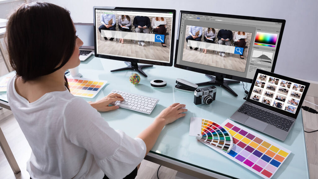
“Five Issues Web Designers Should …” from www.corporatevision-news.com
Designing a website that looks great on all devices is no small feat. With Elementor, a popular WordPress page builder, achieving mobile responsiveness can be easier, but it still requires careful planning and execution. Let’s dive into how you can troubleshoot and enhance mobile responsiveness in your Elementor designs.
Importance of Planning in Responsive Design
Responsive design starts with a solid plan. Before you even open Elementor, think about how your site will look and function across various devices. Planning helps you anticipate technical issues and adapt your design ideas accordingly.
“Responsive Design Begins and Ends With Correct Planning.” — Elementor Academy
Most importantly, sketch out your ideas. Consider how each element will behave on smaller screens. This foresight allows you to create a more cohesive and functional design. Avoid setting values in pixels as much as possible. Instead, use relative units like percentages or EMs to ensure that elements resize properly on different screen sizes.
For example, if you’re designing a header, think about how its components will shift and scale. Will the text still be readable? Will buttons be tappable? Addressing these questions early on can save you a lot of headaches later.
Positioning Elements for Mobile Views
When positioning elements for mobile views, flexibility is key. Elementor provides a responsive mode that allows you to adjust how elements appear on mobile, tablet, and desktop screens. Use this mode to preview your design on different devices and make necessary adjustments. For more insights on optimizing your design, check out these ultimate SEO techniques.
Consider using Elementor’s drag-and-drop functionality to rearrange elements for mobile. Sometimes, a layout that works on a desktop doesn’t translate well to a smaller screen. By customizing your design for mobile, you ensure a seamless user experience. For more tips on optimizing your site, check out these Jetpack alternatives for faster, lightweight sites.
In some cases, you may need to create separate versions of a section for different devices. Elementor allows you to set visibility options under the Advanced tab, letting you show or hide sections based on the device. This feature is particularly useful when you want to deliver a tailored experience for mobile users.
Adapting Elements for Different Screen Sizes
Using Percentages and EM over Pixels
One of the most effective ways to ensure your design is mobile-friendly is by using percentages and EM units instead of pixels. Pixels are absolute units, which means they don’t scale well on different devices. In contrast, percentages and EM units are relative, allowing your design to adapt more fluidly to varying screen sizes. For those interested in optimizing their site’s performance, you might also consider exploring Jetpack alternatives for a faster and more lightweight site experience.
For instance, when setting the width of a container, use a percentage value. This approach ensures that the container resizes in proportion to the screen width. Similarly, use EM units for font sizes to maintain readability across devices. An EM is relative to the font size of the element’s parent, making it an excellent choice for scalable typography. For more advanced customization, explore Advanced Custom Fields features.
Incorporating these units into your design not only improves mobile responsiveness but also enhances overall design flexibility. By making these adjustments, you’re taking a proactive step towards a more adaptable and user-friendly website.
Configuring Padding and Margin Adjustments
Padding and margins play a crucial role in how your design appears on mobile devices. Elementor allows you to adjust these values specifically for mobile, tablet, and desktop views. It’s essential to configure these settings to prevent elements from appearing cramped or misaligned on smaller screens.
Start by setting your padding and margins using percentages or EM units. This practice ensures that spacing remains consistent across different devices. Use Elementor’s responsive mode to preview your design and make fine-tuned adjustments.
For example, if a text box looks too tight on a mobile screen, increase the padding to give it more breathing room. Conversely, if an element appears too spaced out, reduce the margin to bring it closer to related content. These small tweaks can significantly improve the visual appeal and usability of your site on mobile devices.
Controlling Site Elements with Advanced Settings
Elementor provides a suite of advanced settings that allow you to control the visibility and behavior of site elements across different devices. This feature is particularly beneficial when you need to tailor your design for mobile users without affecting the desktop experience. For those interested in optimizing their site further, consider exploring ultimate SEO techniques to enhance site performance.
To access these settings, navigate to the Advanced tab within the Elementor editor. Here, you’ll find options to control element visibility, motion effects, and more. For example, you can choose to hide certain sections on mobile while keeping them visible on desktop. This flexibility allows you to create a more focused and streamlined mobile experience.
Optimizing Images for Mobile Devices

“Mobile Optimization Stock Photos …” from www.istockphoto.com
Images are a critical component of any website, but they can also pose challenges when it comes to mobile responsiveness. Optimizing images for mobile devices ensures that they load quickly and display correctly, enhancing the user experience.
Start by compressing images to reduce their file size without compromising quality. There are various tools available, such as TinyPNG or ImageOptim, that can help you achieve this. Additionally, use the appropriate image formats, like JPEG for photographs and PNG for graphics with transparency. For more tips on optimizing your website, you might find this Elementor Masterclass helpful.
“Position Background Image Certain background images, like that of the example below, may look great in the desktop view. However, it doesn’t take much experience to see how it wouldn’t work well when viewing the site on a mobile screen.” — Elementor Academy
Another important aspect is to use responsive image techniques, such as the ‘srcset’ attribute in HTML, which allows browsers to select the best image size based on the device’s screen resolution. This approach not only improves load times but also ensures that images appear crisp on high-resolution displays.
Using Cover and Center Settings
Elementor’s cover and center settings for background images can be a game-changer for mobile design. By setting an image to ‘cover,’ you ensure that it scales to cover the entire container, maintaining its aspect ratio without stretching. The ‘center’ setting positions the image in the middle of the container, which is particularly useful for maintaining focus on key visual elements.
Utilizing Spacer Widgets for Consistent Layouts
Spacer widgets in Elementor are an excellent tool for maintaining consistent layouts across different devices. By adding spacers between elements, you can ensure that your design doesn’t appear cramped or cluttered on mobile screens. Adjust the height of the spacer to create the desired amount of space, and use Elementor’s responsive mode to preview the changes on various devices. For more tips on optimizing your designs, check out this ultimate SEO techniques guide.
Utilizing Elementor Tools for Troubleshooting
Elementor offers several built-in tools that can help you troubleshoot and resolve mobile responsiveness issues. These tools are designed to streamline the process of identifying and fixing design inconsistencies.
Regenerating CSS in Elementor
If you notice that changes aren’t reflecting correctly on your site, regenerating CSS can often resolve the issue. This process refreshes the styles applied to your elements, ensuring that any updates are correctly displayed. To regenerate CSS, go to Elementor > Tools > Regenerate CSS in your WordPress dashboard.
Syncing Libraries for Updated Changes
Sometimes, the issue may lie in outdated or unsynced libraries. Syncing your Elementor libraries ensures that all elements are using the latest versions. This step can prevent potential conflicts and ensure that your design elements function as intended. To sync libraries, navigate to Elementor > Tools > Sync Library in the WordPress dashboard.
Learning from the Elementor Community

“Be Part of the Elementor Community …” from elementor.com
One of the best resources for troubleshooting and improving your Elementor designs is the Elementor community. Engaging with this community can provide valuable insights and solutions to common issues.
Join Elementor-focused groups and forums to connect with other users who may have faced similar challenges. These platforms are great for sharing tips, tricks, and solutions that you might not find elsewhere. Additionally, the Elementor community often shares templates and design inspirations that can help you elevate your own projects.
Joining Elementor Focused Groups and Forums
Engaging with the Elementor community is a fantastic way to enhance your skills and find solutions to design challenges. By joining Elementor-focused groups and forums, you can connect with other designers who share your interests and may have faced similar issues.
Start by exploring popular platforms like Facebook groups, Reddit communities, and the official Elementor forum. These spaces are filled with users who are eager to share their experiences, tips, and tricks for getting the most out of Elementor.
Participating in these communities not only provides you with practical advice but also keeps you updated on the latest trends and updates in the Elementor ecosystem. You might discover new features or plugins that can enhance your design capabilities.
Moreover, these forums often host discussions about troubleshooting common problems, offering a wealth of knowledge that can help you overcome any obstacles you encounter in your design journey.
“Elementor’s community is a treasure trove of knowledge and support. Don’t hesitate to dive in and start learning from others’ experiences.” — Experienced Elementor User
Accessing Community Shared Solutions
Another advantage of being part of the Elementor community is access to shared solutions. Many users generously share their custom templates, code snippets, and design hacks that can save you time and effort.
When you’re facing a specific issue, search the community forums for similar problems. Often, you’ll find that someone has already posted a solution or workaround. These shared solutions can be a game-changer, especially when you’re working on tight deadlines.
“Finding a shared template that solved my layout issue was a lifesaver. The community’s willingness to help is incredible.” — Web Designer
Besides that, consider contributing your solutions and insights back to the community. By sharing your knowledge, you not only help others but also establish yourself as a valuable member of the Elementor community.
Frequently Asked Questions
As you delve deeper into designing with Elementor, you might have some questions about best practices and troubleshooting techniques. Here are some common questions and their answers to help you navigate mobile responsiveness in Elementor.
These FAQs aim to provide clarity and guidance, ensuring that you can confidently tackle any design challenges that come your way.
Whether you’re a seasoned designer or just starting with Elementor, these insights will be invaluable in creating mobile-friendly websites.
What are the best practices for mobile-friendly design in Elementor?
To ensure your design is mobile-friendly, start by using responsive units like percentages and EMs instead of pixels. This approach allows your design to adapt to different screen sizes seamlessly. Additionally, utilize Elementor’s responsive mode to preview and adjust your design for mobile, tablet, and desktop views.
How can I ensure Elementor sections look good on all devices?
Elementor provides tools to customize your design for various devices. Use the visibility settings under the Advanced tab to show or hide sections based on the device. This feature lets you create tailored experiences for mobile users without affecting the desktop design.
Moreover, regularly test your design on different devices to ensure consistency and usability. Make necessary adjustments to padding, margins, and element positioning to achieve a polished look across all screens.
Why should I use percentages instead of pixels for mobile design?
Percentages are relative units that allow elements to scale proportionally with the screen size. This flexibility ensures that your design remains consistent and functional on different devices. In contrast, pixels are fixed units that can lead to design issues on smaller screens.
What are visibility settings, and how do they help with mobile design?
Visibility settings in Elementor allow you to control which sections or elements are displayed on specific devices. By setting visibility options, you can create separate designs for mobile, tablet, and desktop views, ensuring that each version delivers an optimal user experience.
How can I quickly fix mobile responsiveness issues in Elementor?
Start by using Elementor’s responsive mode to identify any design inconsistencies. Adjust padding, margins, and element sizes as needed. If changes aren’t reflecting, regenerate CSS and sync your Elementor libraries to ensure all updates are applied correctly.
Additionally, seek help from the Elementor community. Often, other users have encountered similar issues and can provide effective solutions or workarounds.


Leave a Reply